AUTOX3
A digital solution dedicated to enhance the customer experience in the automative industry
Overview
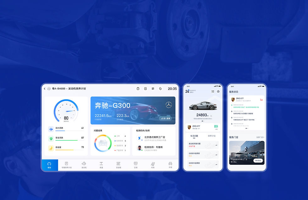
AUTOX3's projects include an app for car owners, an app for automotive technicians, and a large-screen/iPad version for use in garages/auto-repair shops. During my tenure, I was mainly responsible for the design of the large-screen app, and the redesign of the user interface for the AUTOX3 app for car owners, and the CRM system.
Role & Time
UI designer
user interface design, systems design, Guidelines and Standards, Feedback Implementation
3 Months
Challenge
Because this project includes the design of both mobile and large screen platforms, there are some key design differences to consider. Large screens (e.g., desktop computers, tablets) can display more information with complex layouts, while mobile screens require simplified interfaces to avoid information overload. For interaction, large screens can use complex navigation menus and multi-level structures, whereas mobile devices need simplified navigation, often using bottom navigation bars, sidebars, or gesture navigation. In terms of layout, large screens can use multi-column layouts to display more information simultaneously, while mobile devices typically use single-column layouts for easy scrolling.
LARGE SCREEN DESIGN
Home screen deisgn
Define problems and user needs
1. Users want to be able to visually see the presentation of data, to know the current problem/condition of their vehicle.
2. Users want to know what the most serious problem is, what problems may affect their safety or the safety of the car, and what problem requires the most immediate attention to be fixed.
3. The user is also very concerned about the professionalism of the technician, and if they are reliable.
Solve user’s problems
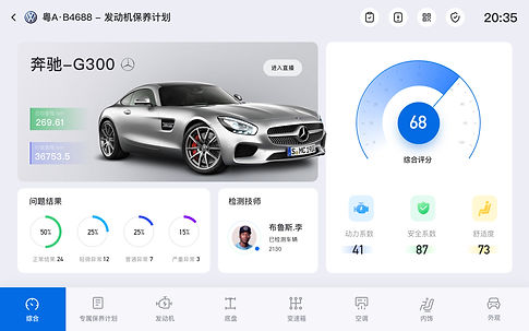
The home screen is the most complex screen because it contains a lot of important information, so it needs to be clean and easy to read. The home screen can display limited information, but different users may have different priorities, so the custom modular settings allow users to choose to display the information they need.

1. In order to solve the problem where users have too many abnormal car conditions and do not know which are the most urgent to solve, I divided the problem results into four categories: "normal", "slight", "medium" and "serious", so that they can intuitively see which are the most urgent problems to solve.
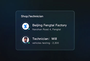
2. I added the previous experience of technicians and the number of jobs they had completed so that users can have more trust in the technicians.
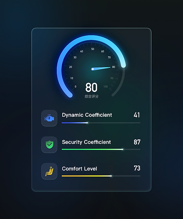
3. I used an intuitive dashboard to display the comprehensive score of the vehicle, subtracting the data and information that most users don't care about so that users can focus their attention on the points that require the most attention. I also added icons above terms like “power factor”, “safety factor” and “comfort” to make all the data more intuitive and understandable
Final Design

Other version

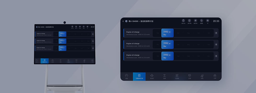
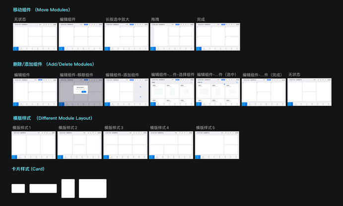
Below, I have listed all the interaction states of different operations such as moving, adding, and deleting modules.
3D Model display page
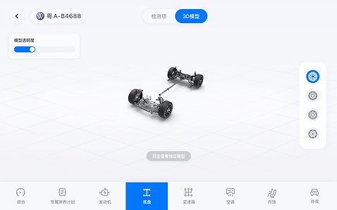
This is the most important interface other than the home page, where the auto mechanic/salesperson can show the customer the condition of the different parts of their car. This allows the customer to better understand which parts need to be repaired immediately, or which parts need to be repaired regularly, etc. On this screen, the model can be zoomed in and out, and rotated 360 degrees to see the fine details. For example, this is a model of the chassis shown here, and on the right I've listed the other parts of the chassis, such as the suspension, the braking system and the tyres, allowing customers to quickly view more details.

Suspension System
Braking System
Tyre
Examining items page
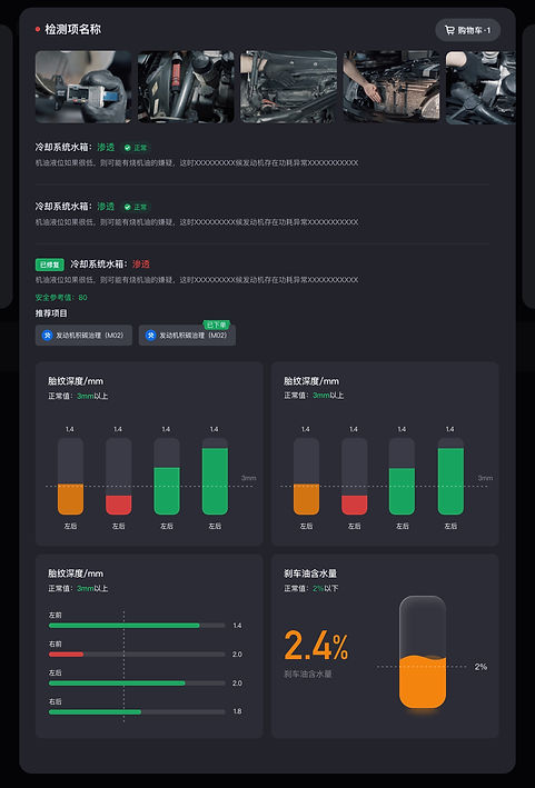
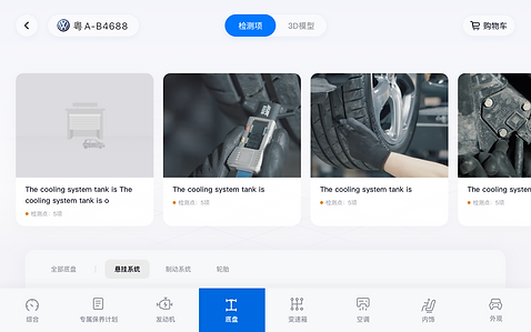
In order to clearly display the technician’s reports on the car parts they have examined, I adopted the approach of card classification. The card design divides the information into small pieces, each containing a group of related content, so that the information display is more clear, orderly, and easy for users to understand. It is also easy to browse and quickly find the information users need. Swipe sideways to show more content.
Card Classification
-
Easy to read
-
Displays clearly and orderly
-
Allows quick browsing

Other main pages




APP DESIGN
Organising the information
AutoX3's mobile apps are available for both owners and technicians. I was mainly responsible for the UI design of the owner side. Before starting the design, I worked with the product manager and other stakeholders to determine the core goals and functionality of the AUTOX3 application, including the main requirements on both the owner’s side, and the technician’s side. In order to make the design process clearer, and make the subsequent project report more convenient, I drafted the below structure map to help me organise the page’s logic.

Registration & Login
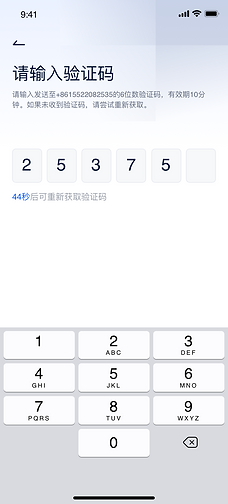
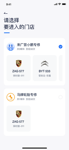
Step-by-step registration and login reduces the stress of filling out all the information at once, making the user experience smoother and friendlier. By walking the user through each step, the burden of information entry is reduced, making the app more accessible to users with less experience with technology.


Home Page
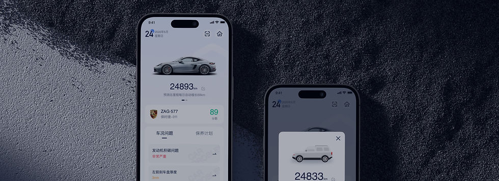
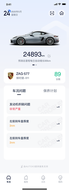
The home page is mainly divided into two modules: vehicle condition and maintenance plan. I again used card classification for the layout here. There is a maintenance plan for each problem. Serious problems are shown in red, moderate problems are shown in yellow and minor problems are shown in green. They are ranked from top to bottom according to the severity of the problem.

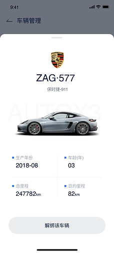
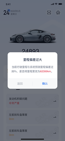
Vehicle information can be edited at the top of the home page. The vehicle can be bound/unbound at any time. When the mileage of the vehicle is exceeded, there will be a pop-up window to remind the user to update the mileage.


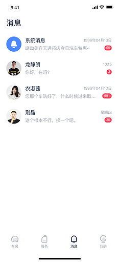
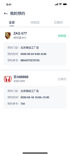
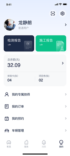
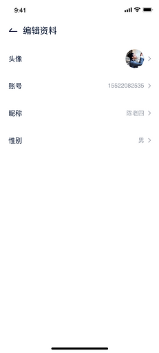
Other Pages






Graphic Design


